In the early hours of this morning (UK time anyway), I was still up despite a long journey home back from the GA Conference in Sheffield. I was watching the completion of a journey that was orders of magnitude further and longer than mine – that of the crew of Artemis II – successfully splashing down off the coast of San Diego after their 10 day voyage to the moon and back.
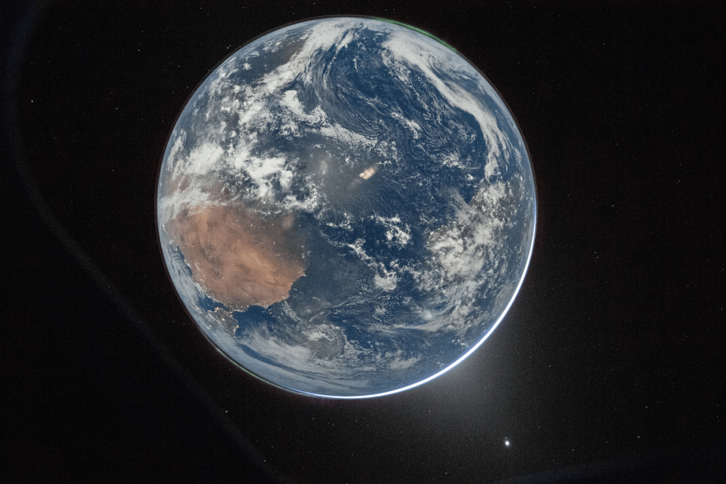
I really want to do a bigger write-up on my experiences as a geographer following the Artemis II mission, but I wanted to share some timely thoughts about the stunning “Hello, World” image before teachers go back to school after the Spring break and enthusiastically use it with their students. Using this image can be a fantastic stimulus for geographical and critical thinking.
Take a different perspective
In space, there is no up and the is no down. And since the Earth isn’t flat, you can approach Earth from any direction and any 2D projection of the planet is actually a ‘fake’ image.
So when we look at this picture of our home, we don’t instantly recognise it. It could just as well be a fictional M-class planet from Star Trek until you look closer. Can you identify land masses? Which ocean can we see?
Grab a globe, digitial or physical and see if you can orientate it to match the image.
Shapes aren’t the only clues, can you spot the green glows in opposite patches of the thin atmosphere? That’s the aurora over the Arctic and Antarctic – so which way is north and south?
Here’s my rough guess:
Appreciating scale and that some things can be big and small at the same time
The Earth is tiny. 36 years ago Voyager 1 had travelled 6 billion km (4 billion miles) miles from Earth since being launched in 1977. It turned it’s camera back towards our home and captured a ‘pale blue dot‘. To the solar system, we a speck of dust. And to the galaxy, microscopic at best.
But our planet is also huge. If the Earth was the size of a basketball, then a human would be no bigger than the size of bacteria or a virus.
So “Hello, World” mostly depicts a planet void of activity and complete natural beauty. However, look closely enough and you can see that even inperseptively small things cluster together to give away their presence. You can see scattered bright dots in places, particularly along the coast of Africa and clustered in the bottom-left of the disc. That’s Europe – the bustling energetic cities and night lights of Spain and Portugal.
You can easily be fooled into human activity isn’t significant if that’s it. Where are all the thousands of planes, their contrails and satellites in low-Earth orbit? Surely with trackers like these below showing such crowdedness, they’d be obvious?
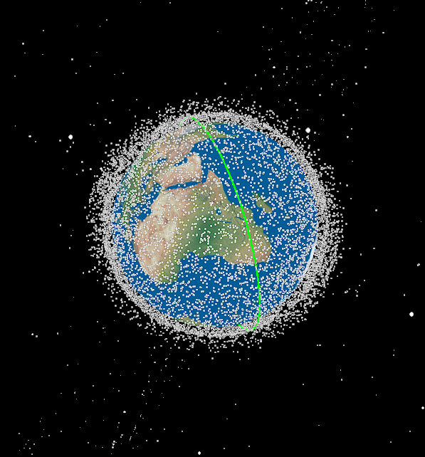
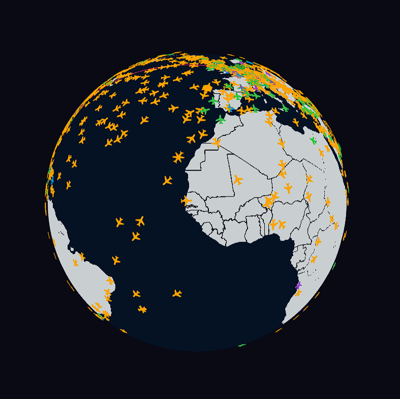
If satellites are on average the size of a car then scaling a human to the size of a bacteria, then planes and satellites at the distance the “Hello, Earth” photo was taken, then they wouldn’t be visible to the human eye, either.
Does Mother Earth look sick?
I’ll finish on this one, and I really hope all educators out there really take care here. I’ve seen this doing the rounds on social media, and until I engaged in geographical reasoning and criticial thinking, I admit I initially had similar sentiments as the commentators.


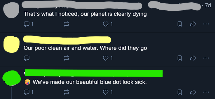
While human impacts on our planet can be observed from space, the human viseral and emotional bias has caused many people of all kids to misinterpret the differences between the famous 1972 ‘Blue Marble’ image and “Hello, World”. And the key thing to note for both, is that they have been processed and enhanced to give clearer images.
In 1972, Apollo 17 astronauts were on the sun-side of Earth, and minor corrections were made to sharpen the image and give it a little more contrast. Whereas “Hello, World” is actually an image of Earth after the sun had set behind it from the perspective of the Artemis II crew. Cameras have come a long way in 50 years. The small but sufficient amounts of light through atmospheric defusion and moonlight alluminated the dark side of the Earth enough for Commander Reid Wiseman to tweak the settings on a Nikon D5 DSLR camera and capture a beauty shot.
Because the camera had to be set up to capture as much light as possible, some noise or ‘fuzziness’ in the image is inevitable, and thus the Earth looks paler and some have said ‘sicker’ than then 1972 image – which itself was brighted and sharpened a bit.
Photographer and science communicator Dave McKeegan has done a brilliant video about how the “Hello, World” image was taken, and why it looks different to the Blue Marble image.
So yes! Inspire your family, friends and students with images from the Artemis II mission, and make lots of hay out “Hello, World” – just make sure to think like a geographer when you do!
