The second ‘Geogramblings’ blog video looks at an event that is currently dominating the news and has everyone speculating – the 2019 Novel Coronavirus (COVID-19). As is typical with such events, the media is awash with news and updates – so keep an eye on trustworthy sources. The World Health Organisation (WHO) have their own set of COVID-19 webpages, one of which includes a good video summary using simple animations and a near realtime GIS situation map. My video will take a look at the issue from a geographical point of view.
Video corrections and references can be found in the video’s YouTube description.
The ‘terrifying’ map
First we start by looking at a map of which some news sources claim shows how the coronavirus will spread across the globe, with some even conflating it with the Chinese government estimating that 5 million people had left Wuhan during the outbreak before restrictions were put in place. The reporters felt they had a firm footing with this claim because the map came from study conducted by the University of Southampton’s World Population Project. But, we need to be cautious here…
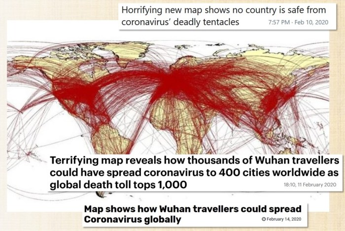
To those of us who have taught or study globalisation, will instantly spot that this is a map tracing every flight from A to B. You can see how lines converge around hub airports such as London (Heathrow), New York (JFK) etc. Yes, in theory, this is how any virus can spread via air travel network, it assumes every flight has a carrier of a the disease at least once and the way that it has been reported, all within a short spave of time. However to use the map and claim that this is how the coronavirus will spread, or even worse, allow the reader to infer that a number of people (be it 60,000 or 5 million) from Wuhan are ‘fleeing’ across the globe in this manner is not just inaccurate but hysterically misleading and alarmist. It is unfortunate that this map was taken out of context, as it led to the World Population Project taking down the Twitter thread that placed this map in context.
As a teaching strategy, displaying this map and having students discuss what they think it shows and then what it actually shows would make for a great starter activity to practise critical thinking.
The start of the outbreak
On 31st December 2019, the local governments of Wuhan and Hubei Province, where Wuhan is situated, confirmed the outbreak of a new virus in the city. Shortly after this, especially by the 22nd January 2020 (the time stamp on the map below) human-to-human transmission was confirmed and now, epidemiologically, the spread can now be declared as an ‘epidemic’. The WHO confirmed the first cases outside of China a couple of days before.

The term ‘epidemic’ is often defined as:
“…the rapid spread of infectious disease to a large number of people in a given population within a short period of time”
However to put this definition into some context, a disease epidemic is abnormal where cases are way above the usual ‘background’ rates of infection and spread. On the other hand, for example, chickenpox makes the rounds every now and then – but this is normal and are so classified as ‘endemic’.
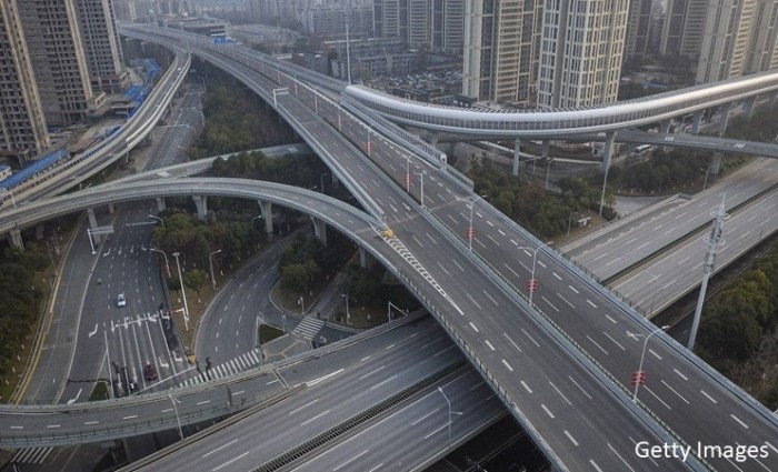
On 23rd January the local authorities took the decision to shut down transport networks such as buses, ferries and subways and cancelled trains and flights. This led to eerie images of empty roads which would normally be bustling.
Unfortunately this was all occuring around the period of Chinese New Year, and already thousands of people had left Wuhan via the above transport links. Perhaps some of them were migrant workers returning home to families in more rural areas (more on that later). And as the animated map below shows, the travel restrictions came too late to stop the spread outside of the city.

COVID-19 has an incubation period of 2-12 days (average of 5 days), and so many infected travellers may have been simply unaware that they were carrying the disease. And when screening processes started, carriers might not have been showing symptoms, cleared screening and then fell ill later.
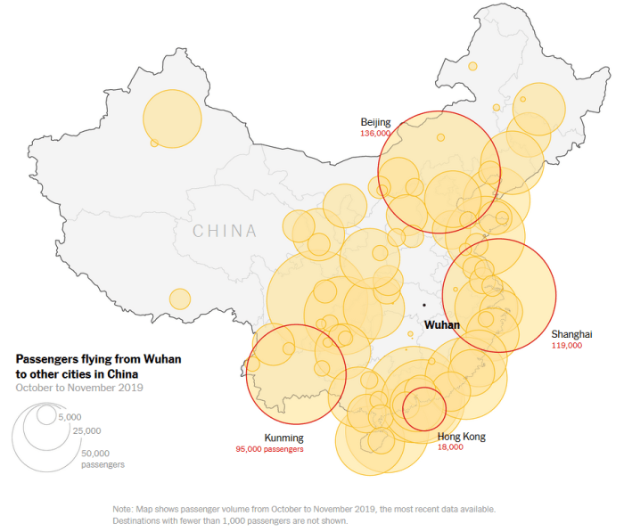
This map from New York Times show the air travel patterns from Wuhan to other parts of China. Wuhan is a hub for domestic travel and this aided the spread of the virus.
Small-world syndrome faciliting illness
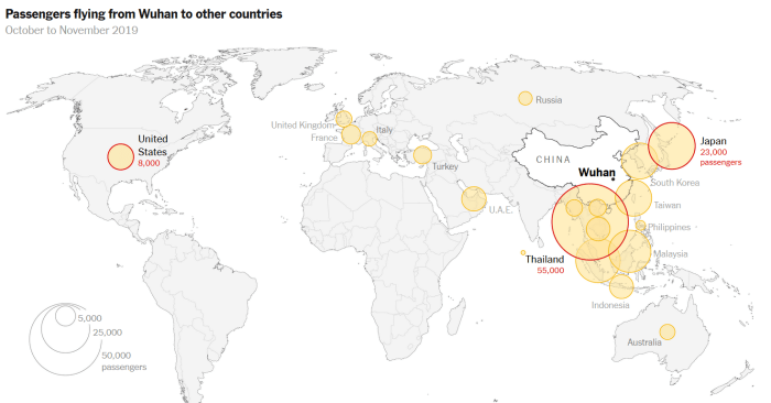
Wuhan is also a hub for international travel, and when you compare the New York Times’ map showing this with the global situation of confirmed coronavirus cases by the end of January (below), they show a remarkable but perhaps unsurprising correlation. Now that the virus has entered other countries through air travel network, it can now begin to spread from those secondary areas. The cluster of cases in Italy, for example, has lead to someone bringing the virus into Wales. Certainly a con of globalisation!

Why Wuhan?
How is it that the virus was able to spread so quickly and was so difficult to contain? The main reason is due to where it started – the city of Wuhan.
Wuhan’s population is around 11 million (9 million in the dense urban area, 19 million if you include the whole metro area). Disease is more likely to spread in densely populated areas where the chances of human-to-human contact is more likely. This coronavirus is spread by the transfer of bodily fluids and droplets which can be sneezed or coughed, or even a shake of sweaty hands. Surfaces can become contaminated and the virus lives long enough to be picked up by people who then touch that surface. In addition to this, restricting the movement of a large number of people is difficult to manage and police.
As alluded to earlier, Wuhan is a major domestic and international transport hub. 111 flights a week take place between Beijing and Wuhan for example, and there are direct international flights to places such as San Francisco, Dubai, New York City and a number of European cities. So there is a regular mass-movement of people from, to and through Wuhan.
It is a hub for industry, and many workers (undoubtedly many migrant workers) work in industries such as construction and global manufacturing. Renault and Peugeot are two of over eighty French firms located in the city, for instance. So there is a large movement of goods as well as people.
Wuhan is a tourist hotspot, including being the gateway to the famous Three Gorges Dam. Being a tourist destination during Chinese New Years adds to the movement of people at the time of the outbreak.
A matter of ‘when’ not ‘if’
Although not yet declared as a ‘pandemic’ by most official definitions (although most believe that’s only a matter of time), epidemiologists and academics have actually been planning and waiting for an outbreak like this for some time.
Co-incidentially, only two years ago at the 2018 Geographical Association National Conference. Dr Hannah Fry gave a fascinating talk about maths, statistics and modelling in geographical situations. Check out my blog entry on that here, and have a look at the ‘BBC Pandemic’ project she worked on – it’s still available on BBC iPlayer – just – so be quick!

Did you like this video and the associated blog entry? Check out my first video blog regarding climate attribtuion and the 2019-2020 bushfire season in Australia. Also, like the Geogramblings Facebook page and subscribe to the YouTube channel!

2 thoughts on “The Geography of the Coronavirus”