Today I test out a new blog post format! I hope you like it and look forward to your thoughts and feedback 🙂
The first ‘Geogramblings’ blog video focuses on the recent bushfires in Australia. But can they be attributed to climate change? How far has the science of climate change attribution come along?
What do we mean by ‘attribution’?
The dictionary definition of ‘attribution’ is:
“the action of regarding something as being caused by a person or thing.” – Oxford
But for me, from a climate change perspective, the term ‘attribution’ means two things:
- To what extent is one thing, or another, or a combination of things is to blame for today’s climate change
- To what extent are current extreme weather events (i.e. events on both short time and spatial scales) due to changes in climate (on a long term, wider scale)
The science on the former is well established and conclusive, while the science on the latter really is only just starting to get more robust.
Attribution of human activity to today’s changing climate
Let’s take a brief look at the first. The organisation ‘Carbon Brief’ has done a lot of work over the last few years to make climate science accessible to the public, in particular though interactive visualisations. The graph below is an interactive visualation from their article Analysis: Why scientists think 100% of global warming is due to humans. The article goes into plenty of depth regarding the studies and processes that went in to make graphs lile the one below. I’ll just stick to the highlights here.
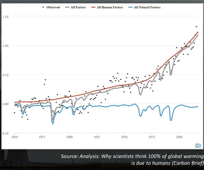
The blue line on the graph above shows Earth’s average temperature anomaly based on natural factors only, such as volcanic eruptions, orbital changes, changes in sun activity etc. What I find fascinating is that you can see the dramatic, but fleeting, cooling impact of each major volcanic eruption – e.g. the huge eruptions of Krakatoa in 1883 and Pinatubo in 1991. But if you look at the trend of the blue line, natural factors have not led to signficant levels of global cooling or warming. If anything, there is a very slight cooling trend. The red line are factors relating to human actions – the emission of greenhouse gasses, land use change etc, and so combining the natural and human factors, we are left with the grey line which strongly correlates with the temperature record (in black dots).
If videos using animated graphs to tell a story is your thing (the next generation of ‘living graph’ you could say), then have a watch of this:
The science of attribution in terms of what is causing climate change of today is robust, well-established and conclusive. If are able to drill-down in the many studies and reviews, fundamentally it all comes down to just applying physics. One example is that if natural causes were mostly or fully to blame for today’s climate change, then the whole atmosphere would be warming, not just the troposphere. But in fact, while the troposphere is warming, the stratosphere is actually cooling.
Attrtibution of climate change to individual ‘extreme’ weather events
Now this is really the hot topic, excuse the pun. Coverage of the recent extreme weather events like the bushfires in Australia and the 2019 European summer heatwave has, almost without exception, contained a measure of whether climate change is to blame. And while there has always been some discussion in the media over the past couple of decades, and skeptics point the finger at scientists being alarmist – well – the fact is, good scientists have as always, just been following the data. Here are some examples of how their findings and language has changed over that time.

In 2003, Nigel Reed from the UK Met Office was quoted that it was ‘impossible’ to prove an exact link between climate change and the infamous European heatwave of that year. Two years later, Kerry Emanuel from MIT pretty much said the same about Hurricanes Katrina, Rita and Wilma. However, by 2013, analysis of whether attribution ‘would pass statistical muster’ was now a thread of scientific research. Zhou et al (2013) attempted to replicate the intense rainfall that cuased the 2012 floods in China using models and found that they were still, at the time, inaquate. But only five years after that, a study by Funk et al (2018) demonstrated that they were able to not just attribute warming of the western Pacific to a drought in East Africa, but ‘man-made’ warming.
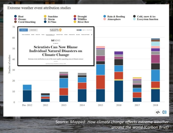
Another Carbon Brief article featuring an interactive map describes that the number of such attritubtion studies have been increasing (graph below), attesting to the rising confidence that weather and climate modelling is better up to the task. Once again the media are steps ahead with claims, but when outlets that cite credible scientific sources run with it, such as this one hosted by Scientific American, then we have have a bit more confidence.
Attributing the Australian bushfires to climate change
You may have heard of El Nino in the Pacfic Ocean? Well the meteorological conditions that have led to a bad bushfire season in Australia are from a similar pheonomenon, consisting of an exceptionally strong temperature gradient in the Indian Ocean. The sea-sawing of temperatures across this body of water is called the Indian Ocean Dipole.

Usually the difference in temperature between the western and eastern parts of the Indian Ocean differ by 0.2*C or so, and very rarely more than half a degree. This year however, the different in temperature is a staggering +2.0*C – that is the western Indian Ocean is two degrees warmer than the eastern Indian Ocean. When the temperatures are this way around, scientists call it a ‘postive’ Indian Ocean Dipole.
The relative and exception warm sea surface temperatures in the west lead to an increase of rising warm moist air, which then gets dumped on eastern Africa as rain. This is why at the same time as the Australia bushfires, eastern Africa has been experiencing flooding. An interesting discussion would be why have those floods not been recieving the same amount of media attention as the bushfires? While on the eastern side of the Indian Ocean, cooler temperatures mean more sinking air and high pressure and therefore the lack of rainfall, leading to sunnier, hotter and drier conditions.
But to what extent is this particular strong positive Indian Ocean Dipole phase attributable to climate change? It is worth noting that the jury will be out for now – since the event is ongoing. It will take time for data to be collected, analysed and modelled by climate scientists. But certaintly the increase in global temperatures make such events more likely to occur.
A website that should be in every Geography and Science teacher’s locker is Climate Signals. This relatively new website is a product of the fact that climate attribution science has really picked up pace. Their database is constantly being populated with more and more extreme weather events from the past as more attitrubution studies are published. But the best thing about the website is the way they visualise links between climate change and weather events.
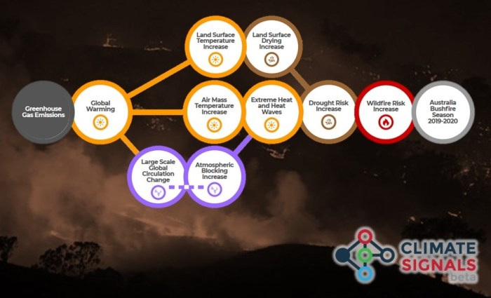
The ‘tree’ above of climate signals illustrates factors that link the current Australian bushfires event to climate change. Clicking on any of the bubbles will take you to an explaination of it, links to scientific studies, real time data that you can explore relating to that factor examples of weather events and other resources.
While the science is solid and robust regarding warmer temperatures leading to the heading of land masses and the atmosphere, leading to drier conditions, you’ll note that there is a dashed line for ‘large scale global circulation change’ and ‘atmospheric blocking increase’. This is where phenomenons such as El Nino and the Indian Ocean Dipole sit. The dashed line means that studies have not drawn a strong conclusion yet, but that the data suggests that climate change is increasing the risk of changes to those factors.
So can we blame the heat and bushfires in Australia to climate change? The answer is probably and likely, but we need more studies, although I doubt no one will be surprised if more studies come out in the next year or two that categorically does make conclusive attributions.
The effects and the responses of the bushfires
I won’t spend too much time on these here, as the internet is full of information, but I would like to share my thoughts using two pictures in particular. One shows a volunteer in an orange jumpsuit holding a koala bear tightly, whisking it away to safety and probably to some treatment in an animal hospital. The second shows a burning house, it’s solar panels on the roof being consumed by fire and its swimming pool being choaked by smoke and cinders. These amazing images come from a gallery published by ABC News, and I strongly recommend you take a look.

One thing that doesn’t get the spotlight as much as destroyed buildings, death or injury, flooded lanscapes etc, are the emotional impacts. And not just those experienced by victims, but volunteers too. The volunteer in the orange jumpsuit has a stern look of concentration on their face, and it is reasonable to assume that the work they are doing is emotionally draining. These volunteers give up their own time, effort and sometimes money to help injured or displaced people, protect property, rescue wildlife etc.
The picture of the house is very revealing. While it is unarguable that any natural or man-made disaster will impact the most vulnerable (particularly the poor) most, this picture tells me that even those on higher income levels are not immune from such events and by extention the impacts of climate change.
The heat and fires are so intense, even the effects are feeding-back into a secondary cause, in the form of pyrocumulonimbus clouds.
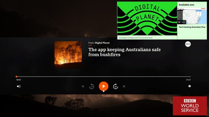
In the 21st century, whether a disaster has hit a higher or lower income country, technology is increasing being used to respond to them. In this audio clip, the BBC World Service’s Digital Planet has a resident in Australia talk about a smartphone and web app called ‘Fires Near Me’ which is helping to safeguard lives and property.
The rest of that Digital Planet episode is worth a listen – as they also talk about how amateur HAM radio operators are helping to report on the spread and impacts of fires where conventional communications have gone down.
I would also advocate every Geography teacher subscribing to the Digital Planet podcast and join their listener’s Facebook group. You can take pretty much everything they talk about and slide it neatly into a lesson or two. Their short clips are great for kids to listen to as part of a lesson or homework activity. Podcast in general are great, because you can listen to them on the commute to and from school and therefore not lose any of that precious PPA time!
Geography teachers at it again…
One of the superpowers Geography teachers have is the ability to churn out a fantastic resource or two in a short amount of time about a current issue or event. Jen Monk got a lot a love on Twitter for this one. Go check it out:
References:
- Carbon Brief: Why scientists think 100% of global warming is due to humans http://www.carbonbrief.org/analysis-why-scientists-think-100-of-global-warming-is-due-to-humans
- Zhou et al (2013) https://www.researchgate.net/publication/298701648_The_2012_North_China_Floods_Explaining_an_extreme_rainfall_event_in_the_context_of_a_longer-term_drying_Tendency
- Funk et al (2018) https://rmets.onlinelibrary.wiley.com/doi/full/10.1002/qj.3266
- Carbon Brief: Mapped: How climate change affects extreme weather around the world https://www.carbonbrief.org/mapped-how-climate-change-affects-extreme-weather-around-the-world
- Scientific American: Scientists Can Now Blame Individual Natural Disasters on Climate Change https://www.scientificamerican.com/article/scientists-can-now-blame-individual-natural-disasters-on-climate-change/
- BBC News (7 Dec 2019) Indian Ocean Dipole: What is it and why is it linked to floods and bushfires? https://www.bbc.co.uk/news/science-environment-50602971
- Climate Signals: Australia Bushfire Season 2019-2020 https://www.climatesignals.org/events/australia-bushfire-season-2019-2020
- ABC News: Wildfires rage through parts of Australia https://abcnews.go.com/International/photos/wildfires-rage-parts-australia-68007797
- Video: Pyrocumulonimbus at the Sedgerly Fire, Queensland https://youtu.be/FUxkzzKuCY0
- Video: Weatherquest Farming Forecast (7th Jan 2020) https://www.youtube.com/watch?v=JKvqw34rmOM
- BBC World Service Digital Planet: Tech tracking Australian fires https://www.bbc.co.uk/sounds/play/w3csy67g
- Jen Monk’s teaching resources: https://twitter.com/Jennnnnn_x/status/1213940375146000384?s=20
 Thank you to Weatherquest Ltd for their support in helping to me to produce my first blog video using green screen! Please do check out their YouTube channel and Twitter feed. You’re certain to find something useful for teaching weather and climate.

4 thoughts on “Climate Attribution and the Australian Bushfires”