UPDATE: February 2019 – Since this post was made below, I’m now employed by WEMC, and further worked on producing educational materials for the Demonstrator, with the prospect of developing a new application. Download the ECEM Demonstrator’s Education Pack, and help us with development by taking the survey (linked below). Thanks! 🙂
After a little break for myself over the last week, I’m back on the blog and in full-swing with various commitments. This week I’m working with WEMC (who are based at the University of East Anglia), and next week I’ll be visiting some high-schools to deliver some training on GIS and student leadership.
My mini-project for this week is to evaluate and help develop a climate and energy visualisation tool for educational use: The ECEM Demonstrator.

The purpose of this blog entry is hopefully to grab a win-win… for me to get some feedback from educators about the tool’s potential use and what can be done to make it more accessible to students, but also to make teachers aware of its existence, as I feel it could tick the ‘GIS’, ‘climate change’ and ‘energy’ boxes in pretty much all the GCSE and A-Level Geography syllabuses.
 The Demonstrator allows you to select different European countries, or ‘clusters’ (regions) and plot graphs for a number of climate and energy variables.
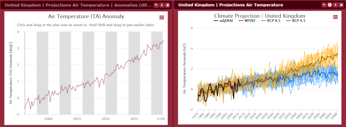
For example, you can choose the UK and plot projections of air temperature up to 2100 based on different climate models. Most useful is that you can keep the plots relatively simple by opting for certain options, such as an average (ensemble mean) of climate models.
If you only use the Demonstrator to look at historical and projected air temperatures, then that in itself is an easy win. But since you can play with plots that give anomalies, or monthly etc, then you can then use it to educate students about how graph plots work, why graphs use means, do some extrapolation etc… The data itself can also be downloaded from an FTP server.

I would therefore like to invite all you readers to have a play around with the Demonstrator yourself, but also to fill in a survey once you have done so.
CLICK HERE for the ECEM Demonstrator educators survey and link to the Demonstrator
The survey can be done in just 5 minutes, or you can spend a little more time giving more detailed feedback. It would be much appreciated! The more feedback I get, the more likely that a newer version of the Demonstrator will have an option to be more tailored for educational use. Stemming from that might be some ‘off-the-shelf’ teaching resources, too! Feel free to get your students to have a play too and help you give feedback, whether it be an extra-curricular group or you have a some space lesson time and a computer room (meh, you never know!)
See what I mean by a win-win? 😉

One thought on “Your thoughts: Interactive climate & energy visual tool”