With @COP25CL #COP25 in full swing, a throwback to an #NGSS workshop by one of the talented @exploratorium Teacher Institute staff back in 2018, demonstrating a range of strategies that makes CO2 graphical data a lively conversation piece. A very useful set of resources for teaching #climatechange.
Click on “View original post” to get the full breakdown and tutorial!
In relation to my previous post, I wanted to focus on one of the Exploratorium Teacher Institute STEM NGSS Conference sessions in more detail as it is directly relevant to all UK GCSE Geography syllabuses. Also it was a pretty cool piece of professional development and worth sharing with folks back home!
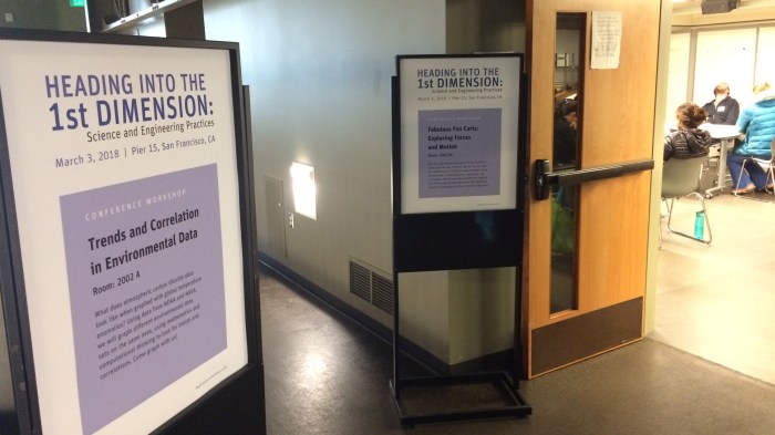
The ‘Trends and Correlation in Environmental Data’ session presented by Lori Lambertson ticks a lot of boxes: various topics about climate change and the carbon cycle; graphical and enquiry skills… Let me take you through it.
1. The ‘anchoring phenomenon’
 Lori starts us off by stating that the basis of the session will be a graph that we will all be contributing too, calling this graph an ‘anchoring phenomenon’. Now this term was new to me (whether it’s new to my UK Science teaching colleagues, I don’t know!).
First it’s useful to define the term ‘science phenomena’…
View original post 1,879 more words
