In relation to my previous post, I wanted to focus on one of the Exploratorium Teacher Institute STEM NGSS Conference sessions in more detail as it is directly relevant to all UK GCSE Geography syllabuses. Also it was a pretty cool piece of professional development and worth sharing with folks back home!
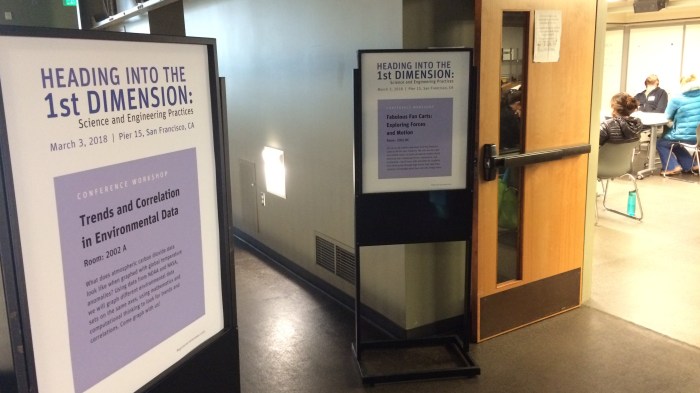
The ‘Trends and Correlation in Environmental Data’ session presented by Lori Lambertson ticks a lot of boxes: various topics about climate change and the carbon cycle; graphical and enquiry skills… Let me take you through it.
1. The ‘anchoring phenomenon’
 Lori starts us off by stating that the basis of the session will be a graph that we will all be contributing too, calling this graph an ‘anchoring phenomenon’. Now this term was new to me (whether it’s new to my UK Science teaching colleagues, I don’t know!).
First it’s useful to define the term ‘science phenomena’, which are “occurrences in the natural and human-made world that can be observed and cause one to wonder and ask questions.” That covers a LOT of stuff! Everything from solar flares to germinating seeds to hair standing on end after being rubbed by a balloon and so many more and then some! So in this context, an ‘anchoring phenomenon’ is therefore:
An observed event or process where a wide range of scientific ideas and evidence are needed to be explored and coordinated with each other in order to fully explain it.
Our anchoring phenomenon will be a graph of rising CO2 levels in the atmosphere.
This approach of starting with the mystery has always intrigued me. To state, I and no doubt my colleagues have planned many lessons where you start with a mystery to be explored, but I admit, not as often as I think I/we should. After all, it’s the basis for enquiry-based learning and the development of questioning skills. Usually the classic approach is go all theory and then ‘let’s do the graph’… It’s an approach often based in hoop-jumping and the need to get through the content. Certainly doesn’t have the same spark.
2. Going all dotty
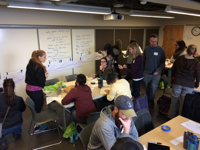
So I just mentioned about the worry of having to get through an activity in a timely fashion? Graphs take too long to draw? Well here’s a simple idea – supply the scale and axes, and use sticky dots instead of plotting points.
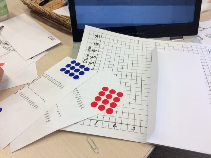
Each participant was given a different year to plot. I had 1999 (I’m gonna party like…!). The red dots are CO2 readings from NOAA’s Mauna Loa observatory, and the blue dots readings from their South Pole observatory (a lovely connection back to my placement at NOAA ESRL, eh!?)


The reason why we were all given a different year to plot (and that everyone’s graph had different values on the y-axis) will be revealed shortly…
3. Time to enquire
So let’s say that in terms of ‘lesson planning’ that plotting (dotting) the graph was the ‘starter’ activity (or perhaps maybe a piece of flipped homework in preparation for the lesson… hint-hint) ;), now it’s time to work on those observation and questioning skills. Lori put a simple question on the screen:

Or as I like to encouragingly say: “say what you see!”

Observations are collated by Lori on the board. Some attendees start to already offer ideas for questions or explanations. Gathering observations is particularly useful with this activity. We may all have plotted different years of CO2 levels, but almost by magic we all have the same patterns: the CO2 levels in the northern hemisphere are almost always higher, those levels go up-and-down more while those in the southern hemisphere are gradually increasing, etc.
Now it’s time to formulate questions:
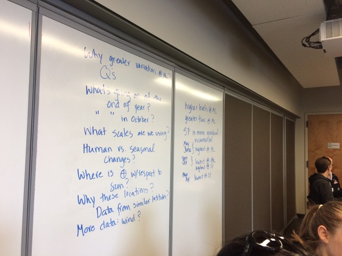
I notice that Lori doesn’t dismiss a single question offered. All of them are valid and welcome. Instead, she states that some of these questions can be answered “within the scope of this session” while some of them may not be. This subtle but potent teaching strategy for me is also a behaviour and engagement management strategy. Think of those kids in every class who want to be involved, who perhaps blurt out ideas but then retreat to their shell when we inadvertently shoot them down for not being on-topic/relevant etc. Or those who are afraid to offer their thoughts for fear of being ‘wrong’. Simply accepting all thoughts and doing that on a regular basis will then become culture and further improve the ‘safe learning environment’. I think that over time, this will lead to more students offering more considered ideas.
NB: SHHHH!
A quick nod to a behaviour management strategy deployed by Lori to get everyone to quieten down. Raise both hands and call out:
WATERFALL, WATERFALL!
Follow with a SHHHHHHHHH! Starting loud but getting softer, floating your arms down as you do it. The ‘kids’ (us) join in at the ‘SHHHH….’ to indicate we’re listening and to signal to others it’s time to listen. Worked for us!
4. The graph: the jigsaw
Now here’s a familiar teaching strategy. I use this method a lot as a way of attempt to have every single child taking responsibility as part of a collaborative effort. So I mentioned that we all had different years, and that some of us had different values on our y-axis to plot CO2 levels? This is so we can put the graphs next to each other and produce a much longer one, going from 1995 to 2016.
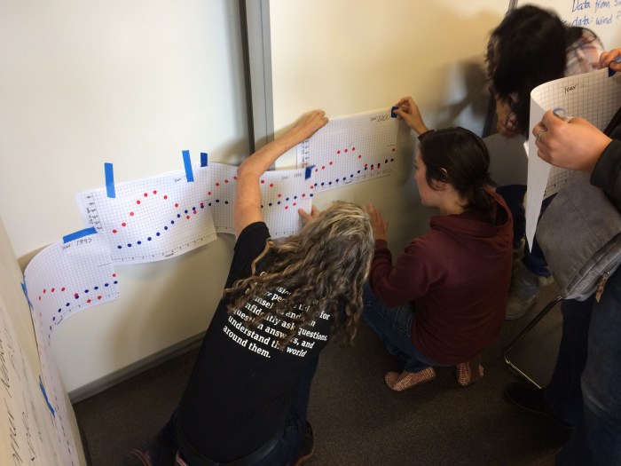
So every participant contributed to this long graph. Seeing my 1999 graph in the midst of a bigger picture was motivating and exciting. I’m sure this would help that child who is borderline disaffected to be more invested into what was going on.
And now we can spot trends, go back to our questions and see if any can be answered, or whether any more questions need to be asked.
NB: THAT kid…
Another worthwhile side-step. One of the participants, John, was busy fiddling with something else. Was he distracted? Not concentrating? Bored? No… he was taking his own approach… He had done his graph but now was determinedly working on something else…
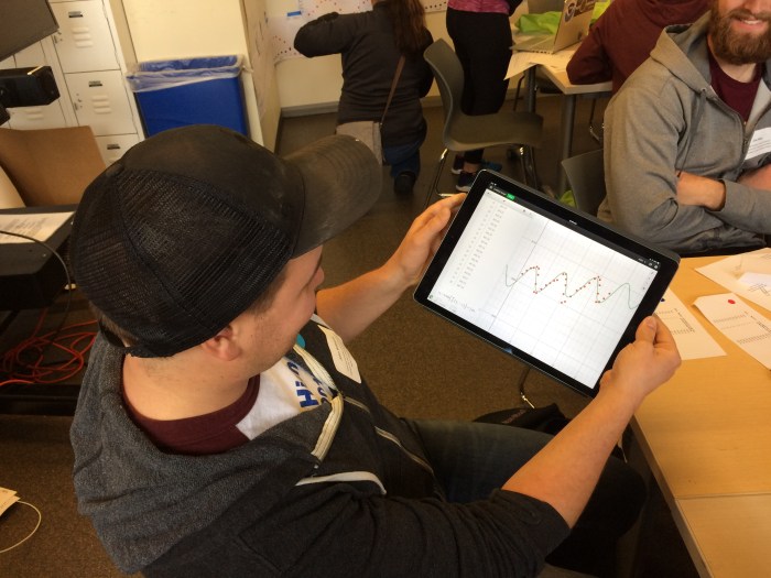
Lori showed interest in what John was doing, which was to use an app on his tablet to see if he could come up with a mathematical sine-based equation that fit with his table’s CO2 graph plots.
Let’s say for arguments-sake that John wasn’t really engaged or interested in what the lesson objectives dictated needed to happen. Should we really be discouraging John from tackling this phenomenon in his own way by asking him to put his tablet away and focus because he isn’t jumping through the hoops? If so (which is, let’s admit, likely), then think about what has been lost there.
Lori didn’t stop the class to focus on John’s approach, but she certainly showed intrigue and encouragement. It wasn’t disruptive. John is doing what we hope all students would do after all… take a different approach to solving a mystery or exploring phenomenon. Can our education systems cater for… no, embrace this!?
I didn’t catch your last name, John, but thanks so much for this! It was interesting and helped me spy a very intriguing observation!
5. Introducing other science ideas, using rice
So now we’ve established trends with our long CO2 graph, explored through questioning and enquiry, we can now dip into other science ideas that help us to explore further and perhaps explain. We know that more and more carbon is going into the atmosphere, but through questioning we wondered how much is stored in the atmosphere in the first place, and where was all the extra carbon was coming from?
The idea to be explored was the Carbon Cycle.
Lori took first took us through what is meant by units such as ‘gigatons of carbon’ (GtC) or ‘petagrams of carbon’ (PgC). What was apparent is that these numbers are very big! There is a lot of carbon in different parts of the cycle (rock, fossil fuels, oceans, atmosphere and biosphere). So, Lori took to representing these amounts by using grains of rice.
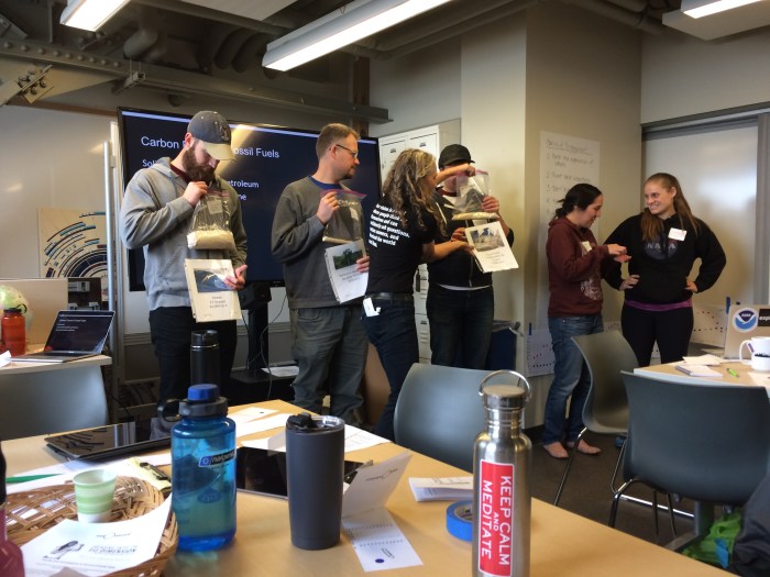
This is all well and good until you get to representing how much carbon is stored in rock. Which is more than 60 million gigatonnes (or 60,000,000,000,000,000,000 kilograms!). We had to do a mind-experiment to visualise that one! (I’m sure I remember right, but please fact-check me on that!)
Through looking at the carbon cycle, we discover that we accelerating the carbon cycle in a way. Processes what should be part of the slow carbon cycle (e.g. locking carbon into fossil fuels) are now becoming part of the quick carbon cycle (e.g. burning fossil fuels, releasing CO2 into the atmosphere).
6. Repeat, and correlate
We moved onto doing the same graphing activity but this time with sea-ice extent and average earth temperature. Same process… each with a different year, using sticky dots, then putting the graphs together to look at the trend. We juxtaposed this new graph with the one already on the wall showing CO2 levels. This naturally allowed for more enquiry and discussions about possible correlations and links.
This is where the session ended due to time, but you can certainly see how you could continue on with this kind of anchor phenomenon and enquiry-based approach. If you wanted to go statistical-based, you can test the correlation, for example. You could even go off at a slight tangent and now see if the cause of the rises is really man-made or natural by pulling in other datasets.
In reflection
I’m now thinking about my approach to teaching the AQA GCSE Geography topics on climate change and completely overhauling those set of lessons, where the starter of the first lesson is the graph and then over the time allotted to focus on anthropogenic (human-caused) climate change, see where the enquiry-led learning goes. It would have to be steered, unfortunately to the specifications of the course.
The resources for this session can be downloaded from the Exploratorium website here:
A massive thanks to Lori for tolerating me being something akin to a pesky fly that you just want to swat out of the way! But she was very gracious with me buzzing around communicating with all the participants and getting involved. Her enthusiasm is very infectious and we all left the morning session buzzing about graphs and big numbers! (Did I just use the word ‘buzzing’ in the same paragraph in two different contexts? Go me!)
Lori has her own website full of useful resources and activities. If you teach Geography, Science and Maths in particular, I strongly urge you to go have a poke around. You will find something useful!
And finally, if you are building a resource bank to teach climate change, please take the time to look at my other posts on the topic, since a lot of the work I have done so far during my sabbatical has been related!
Update (17th April 2018):
I was delighted to hear colleagues are using this resource in their teaching and teacher-to-teacher CPD. I had a lovely message from Judith Hewitson who used this to deliver some summer-term CPD at Alleyn’s School in London. I’ve duly passed on the thanks to Lori and the Teacher Institute team.
Keep collaborating everyone! Geographers Unite!! 😉
Enjoyed this entry? Please sign up to email alerts by clicking on the ‘Follow’ button in the bottom right, giving you a shout when I post again in the near future! 🙂
 P.S. My sabbatical is self-funded and un-paid. Please check out my paid resources at TES and Teachers-Pay-Teachers! If you are looking for teaching resources for all subjects, not just Geography, please check out ZigZag education’s catalogue by clicking through my affiliate link here. If you do find something useful and purchase, I’ll get some commission to help me pay for a public transport fare etc! 😉

Reblogged this on The Life Geographic and commented:
With @COP25CL #COP25 in full swing, a throwback to an #NGSS workshop by one of the talented @exploratorium Teacher Institute staff back in 2018, demonstrating a range of strategies that makes CO2 graphical data a lively conversation piece. A very useful set of resources for teaching #climatechange.
LikeLike
Wow! There are so many great ideas on this post! I love it. I will definitely bookmark this page. I get to attend the Exploratorium training in a few weeks and I can’t wait!!!
LikeLiked by 1 person