The Gender Census is an annual online survey aimed at collecting data on gender language preferences. Launched in 2013, it gathers responses globally, providing valuable data that supports academia, activism, and businesses. The 2024 survey gathered over 48,000 responses. This initiative, led by Cassian Lodge, encourages respectful gender language usage and fosters community among gender-divergent individuals. A fantastic initiative that demonstrates the beautful intersectionality between human geography and queerness.
Tag: data
How to Use Carbon Brief’s Attribution Interactive Part 1 – How Climate Change is Impacting Extreme Event Trends
This mini-series offers teaching ideas for using Carbon Brief's Extreme Weather Attribution Interactive Map, focusing on climate change's effects on extreme weather. Part 1 is a resource to guide learners through analysing data trends in extreme events like heat, storms, and droughts using spreadsheet apps like Google Sheets.
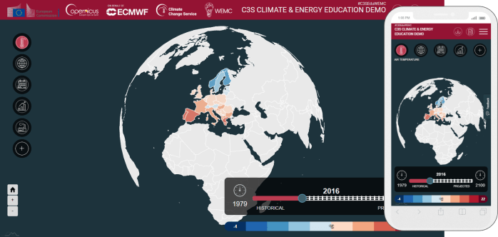
Examples of climate and energy data visualisations and how they can be used in the classroom
An article written for the World Energy and Meteorology Council (WEMC). It is becoming increasingly common place that education departments of governments around the world are including climate change in statutory policy. One such example is the recently released Sustainability and climate change: a strategy for the education and children’s services systems by the UK … Continue reading Examples of climate and energy data visualisations and how they can be used in the classroom
European award for Climate Change GIS! (and other teachable goodies)
Find out whether a GIS for schools using climate data which I helped develop won an award from Copernicus ECMWF. But also check out the other amazing nominations that a teachers could use in the classroom.
Gender Identity in the 2021 Census
Gender Identity in the 2021 Census 2021: I reflect on this news with both a personal and a geographer's perspective. In both cases, I'm excited and somewhat relieved.
Contagious and outrageous! (GAConf18 Review Pt.3)
My final @The_GA #GAConf18 review. Inspiration all round: from adventurous geog teachers, passionate trainees, those who work behind the scenes and even, maths! Featuring: @FryRsquared, @DrGrovesGeog, @Re_Ferg, @THEWATERDIARIES, @LucyOxley
Visualise it
Visualisation is an important tool in promoting knowledge and understanding. Presented here are a number of visualisations that educators across curricula may enjoy and find useful. Featuring: @exploratorium, @cnscenter, @worldmapper, @NatGeoMag, @gapminder
Postcards from a NOAA network
NOAA's carbon cycle monitoring network is global, showcasing a range of landscapes. Here are some of my favourites.


